Ben Scruton - Artist Spotlight
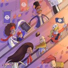
After studying illustration at Kingston University, Ben Scruton burst onto the London Illustration scene. His first commission was a national advertising campaign for Orange, since then he has worked with many household names including Friends of the Earth, Tesco, Homebase and Nesta to name just a few. Best known for his character driven work and humorous style, Ben has recently been developing his portfolio. We've spoken to Ben about his illustrations, his love of people watching and how his passion for cycling fuels his creativity. Here are Ben's thoughts along with some of our favourite pieces of work.
What made you want to be an illustrator?
My dad was an illustrator, as a child I was always fascinated by his work. I loved to look at his pots of paint and had all his books, but was adamant I wasn't going to be an illustrator, I wanted to do my own thing. So I went to Kingston to study graphic design and did the foundation course, but found out that I didn't really like graphic design and was much more interested in illustration. I switched to the illustration course and much to my horror I ended up following my Dad's path exactly.
Is your style similar to your Dad's?
No, his work was very traditional and specifically for children's books, he worked in house at Walker Books, he was very much into the paints and inks. When I was younger I was always frustrated, as I couldn't get what I was doing to look like his stuff, but I found my own way through.
Your work is very character centric, was that a conscious decision or did it just happen?
During my degree my main interest was character design and development. I then worked on a few projects that were character based and it carried on from there really.
You've created characters for a huge variety of projects ranging from national ad campaigns to editorial features. Where does the inspiration for the characters come from?
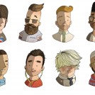
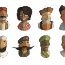
Most of my characters are based on people I've met, I have a sort of mental catalogue, which I draw upon. I vividly remember certain people I come across, mostly people with a distinctive style. When I start a project I read the brief and an image of the person I want to draw comes into my mind. I don't do many takes on it, it just comes out very naturally. For example, I drew a movie director for the Orange campaign, who was based on a guy I met when I did some work with the BBC. He wasn't a director but his style just stuck in my mind, I added glasses to him but the character was definitely based on him. I do a lot of people watching, which was the inspiration for my Barber Shop series. I lived in Pakistan for a few years and all the guys I knew locally had different facial hair and I found it really fascinating. There were lots of different moustaches and beards, everyone had their own distinct take on the whole thing. For example the policemen would have fantastic moustaches. If you were in authority a moustache was essential, it was very much a status symbol. I wanted to capture the cultural references in the different beards so I started doing studies of the people I met. When I returned to London, I thought it would be good to explore a London version showing different hairstyles.
Your characters have a very distinctive look and feel, but their shape has recently changed, becoming more realistic in form and proportion, what prompted the development?
Originally all my characters were based on an egg shape with arms and legs, which I found to be aesthetically pleasing. However, certain briefs would come through where my style struggled, the shape had it's limitations. A few years ago a client just wanted a pair of legs, which was when I first explored how it would look if I was doing something more anatomically correct and less cartoony. I'd been experimenting with the style for a while and then recently I was doing a portrait for a friend; he's a cyclist and really skinny, so I really had to move away from the 'egg man' shape. I was pretty pleased with how it turned out and I've kept pushing from there.
How easy have you found it to develop your style?
I struggled initially because it looked like I was just bolting limbs on, but I've worked hard at it and tried to get some sort of flow into it. I've also been trying to introduce more backgrounds, rather than just focus on the character. Because of the projects I was working on, it was getting to the point where my portfolio was just full of characters on white backgrounds, so I've been working on scenes. I've really enjoyed the development work, being an illustrator is definitely a constant learning process. It's a bit of trial and error pushing it forward, I'm getting through a lot of paper at the moment. But looking at my work now, I'm doing things that I wouldn't have thought I could two or three years ago. I think having an agent, is a great help though. You can get lost in creating pieces, so having chats about development work and someone saying 'when's the next thing coming' is great.
You mentioned cycling earlier, you're a big cycling fanatic, would you say cycling has influenced your work?
Very much so. I'm a member of Brixton Cycles and there are quite a few creatives in the club; illustrators, graphic designers and artists, who are all freelancers so it's a nice group to be with. Cycling seems to appeal to creatives in particular, it's become a little cultural niche. I think it's the opposite of creativity in a way. Your brain can really shut off and you just get on with what you're doing, whether it's the weather or fixing your bike you just get on with it. It's a good way to switch off. Also some of my new work is directly inspired by cycling. On one ride out of London you go around a corner and you are suddenly in the countryside, popping up above the clouds. I usually arrive just as the sun is coming up and if it's a grey miserable day in London the sun is usually out there and all you can see is a gorgeous valley of green rolling hills. In my new piece 'Above The Clouds' I was trying to explain how that feels and to give the impression that you get coming out of the city.
You've worked across such a broad range of projects what do you think it is that attracts people to your work and what do you want people to take away from it?
People mention the humour in my work a lot. It isn't something I add intentionally, it seems to come naturally when I'm drawing. In terms of what I want people to take away from my work, I want them to enjoy it. I really like the challenge of bringing things to life, sometimes the more mundane the brief the better, it really allows my imagination to run wild. So if I can inject a little bit of humour into someone's day then that's great.
To see more of Ben's work, click here.

